
 |
|Introduction
The 2024 WebAIM Million Study of 1,000,000 home pages revealed a group of 6 bugs present on 96% of the pages. Let's make sure your portfolio site is not one of them.
Color contrast
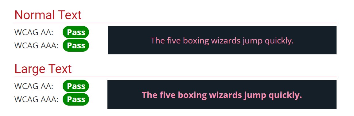
Text 18.5px or smaller:min. contrast ratio of 4.5:1
Bold text larger than 18.5px:min. contrast ratio of 3.0:1
Text 24px or larger:min. contrast ratio of 3.0:1
Mind the color contrast ratio to help users with low vision
For users with low vision reading can be challenging when the text color doesn't stand out much from the background. Noticing interactive elements like buttons or form inputs is also difficult if the background or border does not contrast enough with the surrounding content.
To avoid these problems, we rely on color contrast ratio tools to compare the difference in luminance (brightness) between any two colors. The ratios 4.5:1, for smaller text, and 3.0:1, for larger text, are minimum values expected in order for your content to be accessible to users with low vision. In terms of accessibility guidelines, this is a AA level requirement.
The desirable AAA level requires a 7.0:1 contrast ratio for smaller text, and 4.5:1 for larger text. Whenever possible, aim for the AAA level as it provides the best experience for users with low vision.
How to check the color contrast ratio
When you run an accessibility report with automated tools like Google's Lighthouse or axe DevTools, if any elements failed the contrast ratio guidelines, you will know right away.
If you'd like to be more proactive and test your colors as you're building, use WebAIM's contrast checker.
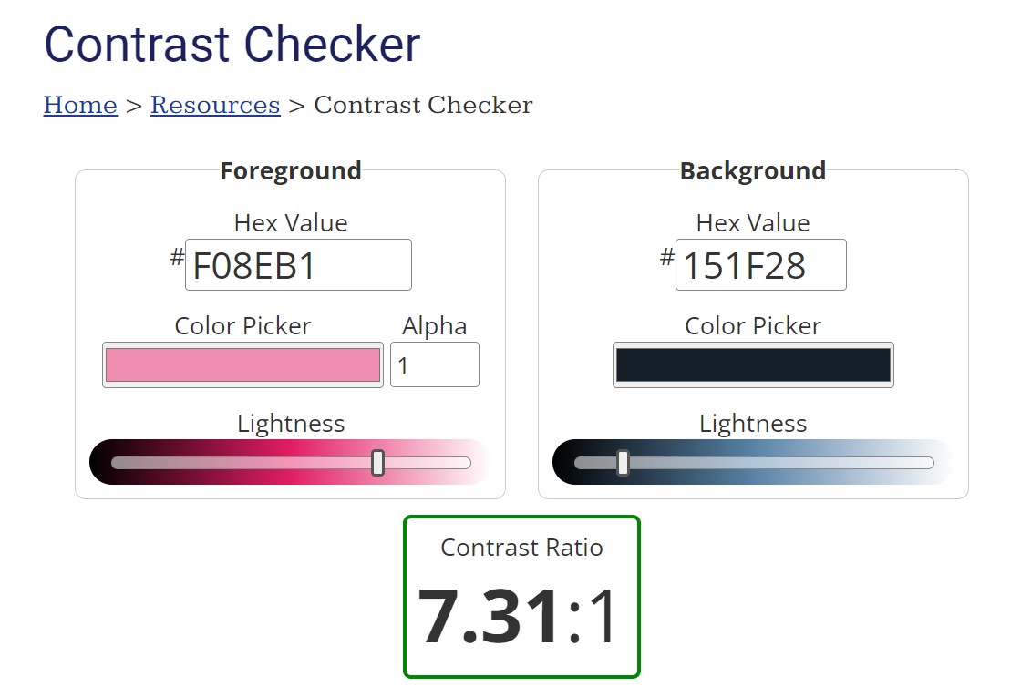
Checking the color contrast is straightforward:
✔enter the foreground and background colors for a given element
✔the tool calculates the contrast ratio
✔you receive a pass or fail result for the AA and AAA levels of compliance
A neat feature of the tool: it provides luminance sliders that allow you to adjust the levels and see how the contrast ratio changes.
For quick access, you can also add the contrast checker to your Bookmarks bar in one easy step!
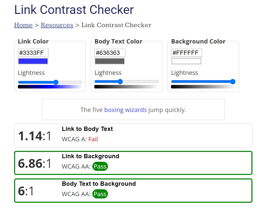
Did you know?Links also have to follow the contrast rules!
Here's a quick checklist to make sure your links stand out from the surrounding text and the background:
✔Contrast with background is at least 4.5:1 for smaller text, and 3.0:1 for larger text
✔Links are underlined, OR the next two conditions are met:
✔Contrast with surrounding text is at least 3.0:1
✔Non-color visual clues (like underline or a focus ring) are available on mouse hover and keyboard focus
And to help us, WebAIM has a special links contrast checker.
The "alt" attribute for images
<imgsrc="..."alt="Fill me in or leave me empty, but do include me!"/>Help screen readers decide whether to announce an image or not
Is your image purely decorative? Or, is the information presented in the image conveyed by the adjacent text as well? Then it's best to leave the alt attribute empty.
Does your image contain essential information that is not available in the text? Then add a short description in the alt attribute. No need to add the word "image" or "picture" in the description, as screen readers announce it as an image by default.
Either way, it's important to add the alt attribute to all images.
Missing, empty, or descriptive alt? alt attribute
Missing: screen readers might read the source file name. When you have an image, the attribute is required!
Empty: screen readers ignore the image. If your image is purely decorative, the attribute should be empty: alt=""
Descriptive: if the image is important for understanding your content use the attribute to describe it: alt="some description"
Remember: A missing alt attribute is NOT the same as an empty alt!
<a href="https://www.linkedin.com/company/webforeveryone/"><i className="fa-brands fa-linkedin" aria-hidden="true"></i></a>Help screen readers properly announce a link
You have to be careful with your social media links. If they are coded like the example above, they are not accessible.
The link to the LinkedIn profile contains an icon and no visible text. A screen reader will announce part of the url (usually starting with the path segment) and provide no information about the destination of the link.
The problem: the link doesn't have an accessible name! Assistive technologies recognize an interactive element by its accessible name, but the browser can not compute it here since none of the attributes that could provide one is present.
Follow this link to review the accessible name, or continue reading for a list of solutions.
Ways to fix the links to social media profiles
✔ Replace the icon with text (e.g., LinkedIn).
✔ Keep the icon, but add text with a
visually-hiddenclass (so the text is not visible on the screen). Screen readers will announce the text, while sighted users will rely on the icon to figure out the purpose of the link.✔ Add
aria-labelto the link element (e.g.,aria-label="LinkedIn"). A quick reminder that, in general,aria-labelis not a great choice for internationalization (for example, the text is not guaranteed to be translated by all browsers), but it's not a concern here since we are dealing with an internationally recognized brand name.
What about the alt attribute? An icon displayed with an <i> tag does not accept this attribute like an <img> tag would.
In the next section on buttons we will look at an example with an image and the alt attribute.
Labels for inputs
// Implicit label by wrapping the input<label>Enter your full name: <input id="name" type="text"/></label>// Explicit label by referencing the id of the input<label for="name">Enter your full name:</label><input id="name" type="text">Help assistive tech users understand the purpose of an input
When it comes to your portfolio site, labels and inputs are likely to be part of your contact form. We will look at ways to make your contact form accessible in a separate article, but now let's focus on the label and input elements.
Why are labels important?
For screen reader users, the label is the only way to understand the purpose of the input.
Speech command users rely on the label to select the input or any other form field.
Sighted users can click on the label to bring focus to the input. If you are a sighted developer, this is actually an easy way to test if a label is properly associated with an input.
Which method should you use: implicit or explicit?
Both are valid, but the implicit method (label wrapping the input) will cause problems for users relying on speech commands, specifically those using the Dragon NaturallySpeaking software. Why? Well, simply because there's a bug in their code!
Since Dragon is the most popular speech recognition software, it's best to use the explicit method (with the for attribute) until they fix the issue.
The language attribute
<html lang="en">Use a valid language in the lang attribute
It enables screen readers to correctly identify the language of a webpage, so it can use the correct pronunciation.
Is it common for a project to lack this attribute? Not at all! That's because when we initiate a new code base we are likely to use editors that generate an HTML file pre-configured with all the essential elements, including the lang attribute.
Portfolio sites that started as templates though might be missing it. These templates are designed to be customized, so remember to add the lang attribute with the value of the language you are using.
Did you know?The lang attribute can do a lot more!
It can take a specific dialect:
<html lang="en-US">It allows you to specify the language of a certain word or section of the page:
<p>Hello in English, <span lang="fr">Bonjour</span> in French.</p>What next?
Congratulations! You are now familiar with the 6 most common accessibility issues and how to avoid them in your portfolio site. Ready to continue your accessibility bug hunt?
Read next: Level up: the next 6 bugs to watch for